The Art Direction Is the Prompt
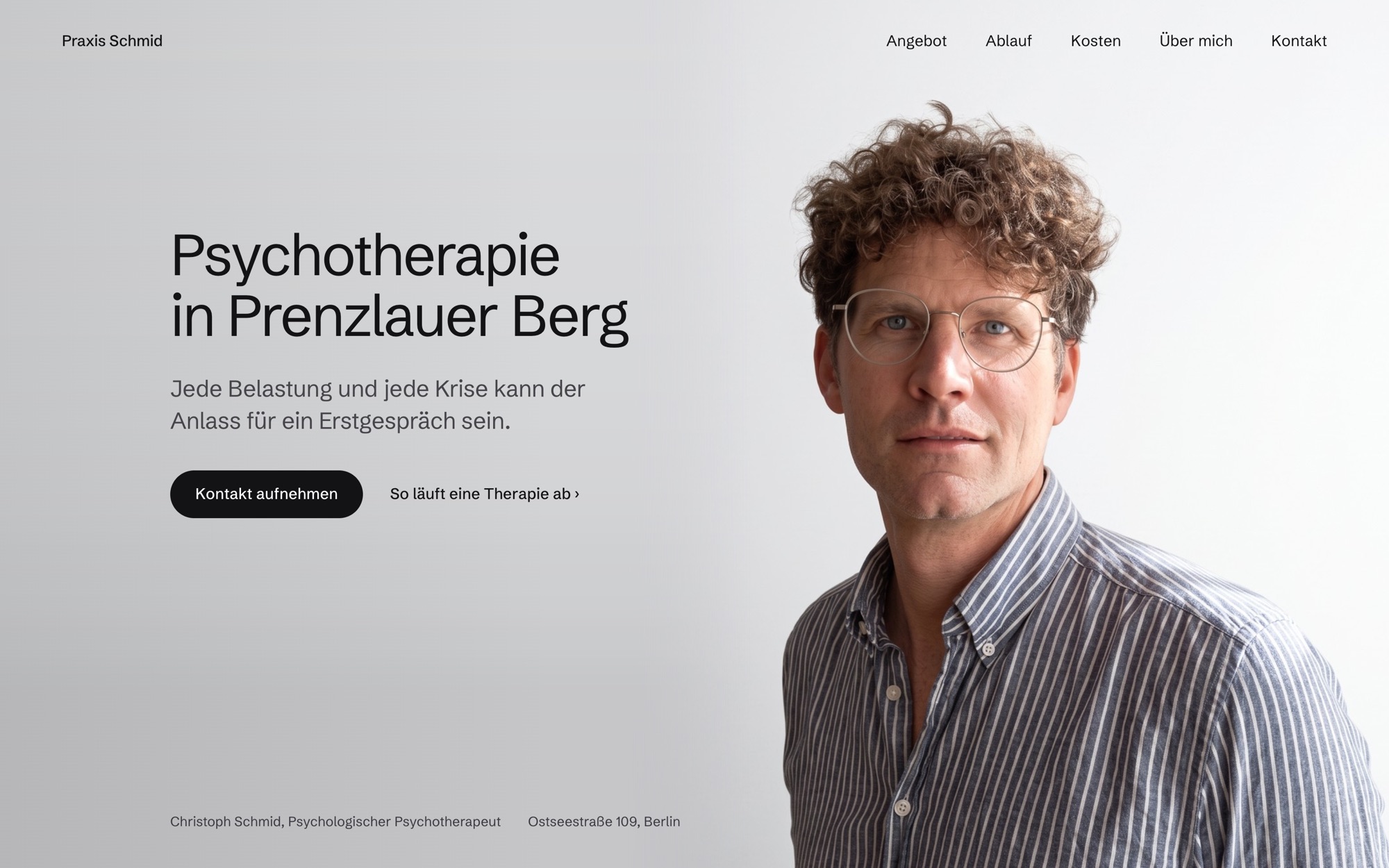
Christoph’s brief for his practice’s website was the good kind: calm, monochrome, no advertising. There was no moodboard and there were no reference sites — they would have been the weaker input. The translation is my job: “calm and monochrome” means attitude, type, space, reduction, and that is exactly the vocabulary the prompt is written in. If you can name design precisely, you get it precisely — and none of it ends up looking like a site builder. The art direction is the prompt.
The frame: a private psychotherapy practice in Berlin, from briefing to launch on praxisschmid.com in one week of work, orchestrated in dialogue with Claude. Even the briefing ran in that mode — a questionnaire generated from the project description, one round with me, one with Christoph, eighteen local practices analysed on the side. After one day, positioning and site structure were standing.
The cadence: rounds instead of meetings. Every round comes back as a scrollable draft, contested points straight away as two or three variants side by side. My feedback is language at every altitude — a paragraph of art direction here, “the hero edge has a dent” there. Christoph’s requests arrived via WhatsApp and went into the chat verbatim; by evening they were live, because the push is the deployment. Roughly forty rounds added up that way, and I said no about forty times; every no was a design decision. Before I see anything at all, Claude has rendered the round in headless Chrome, compared pixels, clicked through states. Still, nothing goes live without my go. Full autonomy in the work, zero autonomy in publishing — that separation is what makes the process client-grade.
We photographed the portraits ourselves; Claude retouched them with Higgsfield in its strictest mode: light and background yes, the face untouchable. Anyone who has watched image models eagerly “beautify” faces knows why that line has to be hard — identity is non-negotiable, least of all for a therapist whose face is half the promise of trust.
Motion follows the same principle. The camera move around the practice’s two armchairs comes from Kling, turned into a video where every frame is a keyframe, with the timeline hanging not on time but on scroll position. It’s running live in this article right now — scroll on, slowly:
The foundation happened in the same conversation, between two design rounds: framework choice, repo, Vercel wiring, redirects, OG images, Search Console. None of it was its own project. It was sentences.
What matters most, though, is what all of this was in service of. Anyone landing on this site brings real hesitation with them — the visit alone is a step. So every decision lowers a threshold: clear steps instead of clinical prose, calm instead of stimuli, down to a pre-written message for everyone who finds writing hard. This site is deliberately not the loudest piece in my portfolio. It is the right one for exactly these visitors, and getting that precisely right is the design work that counts.
This site, by the way, was a favour for a friend — and still, it puts on display what is actually shifting right now. This project used to take Figma, an external developer and a few weeks of coordination. Today it is one person in dialogue. What has become cheaper is the production, not the design: translating “calm and monochrome” into attitude and type, the forty nos, knowing what a therapy site doesn’t need — that remains the work, however fast the tools have become.
I’m in good company with that shift — but the real feeling is something else: for the first time in 25 years, the only thing between what’s in my head and what’s online is a conversation. Designing has never felt this free to me. And I fully intend to use it.