Case
Volkswagen
The New Brand Design — brought to every digital touchpoint in the world.
Volkswagen is changing. From a pure carmaker into a provider of modern mobility. The New Brand Design is the logical consequence: in just nine months, a completely revised brand emerges from the “powerhouse”. Design language, visual identity, communication style. Everything new, everyone at one table.
Right in the middle: the digital layer. For almost two years I own Digital Design there. As Product Owner, with a large team of designers and engineers, between Wolfsburg, Hamburg and the agency.
My product is the Living Styleguide: the tool that makes the new brand tangible for every digital touchpoint. Worldwide. Not a PDF that dies in a folder, but a living system. Component-based, continuously updated, used and questioned by teams around the globe.
Illustration, motion and interaction are not decoration in it. They define how the brand behaves — not just how it looks.
My responsibility
Four systems. And the quality afterwards.
Living Styleguide
The central product, my core mandate as Product Owner: makes the new brand tangible for every digital touchpoint. Worldwide.
Basic App Styleguide
Also owned by me: the rules by which apps add to the holistic brand experience.
Illustration Styleguide
Built independently on the side. Defines the brand's illustration style — globally.
Motion Principles
Designed by me: how Volkswagen moves. Timing, curves, behaviour.
Quality Assurance
After the rollout I switch perspective: securing the quality of implementation across the digital touchpoints.
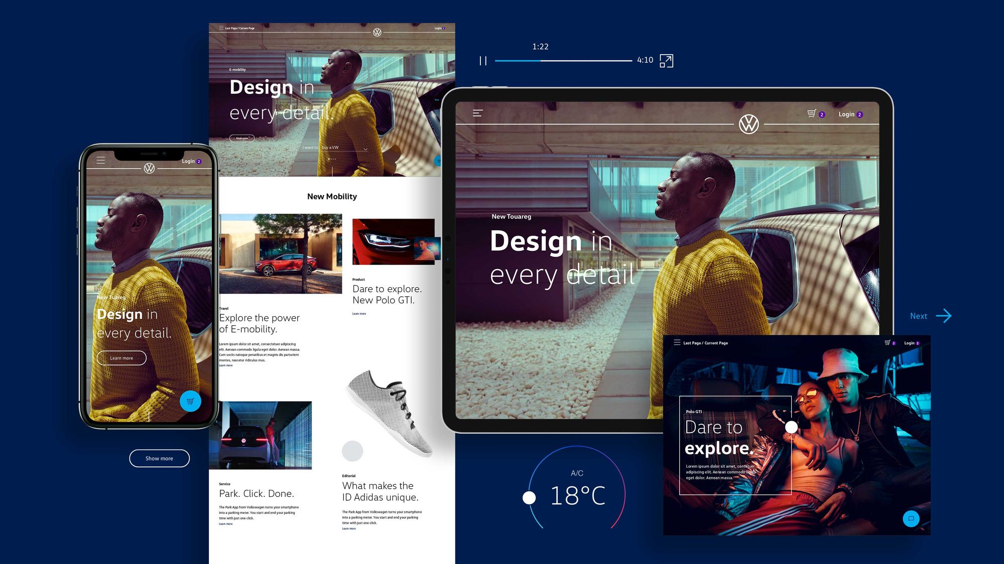
A system built to be used
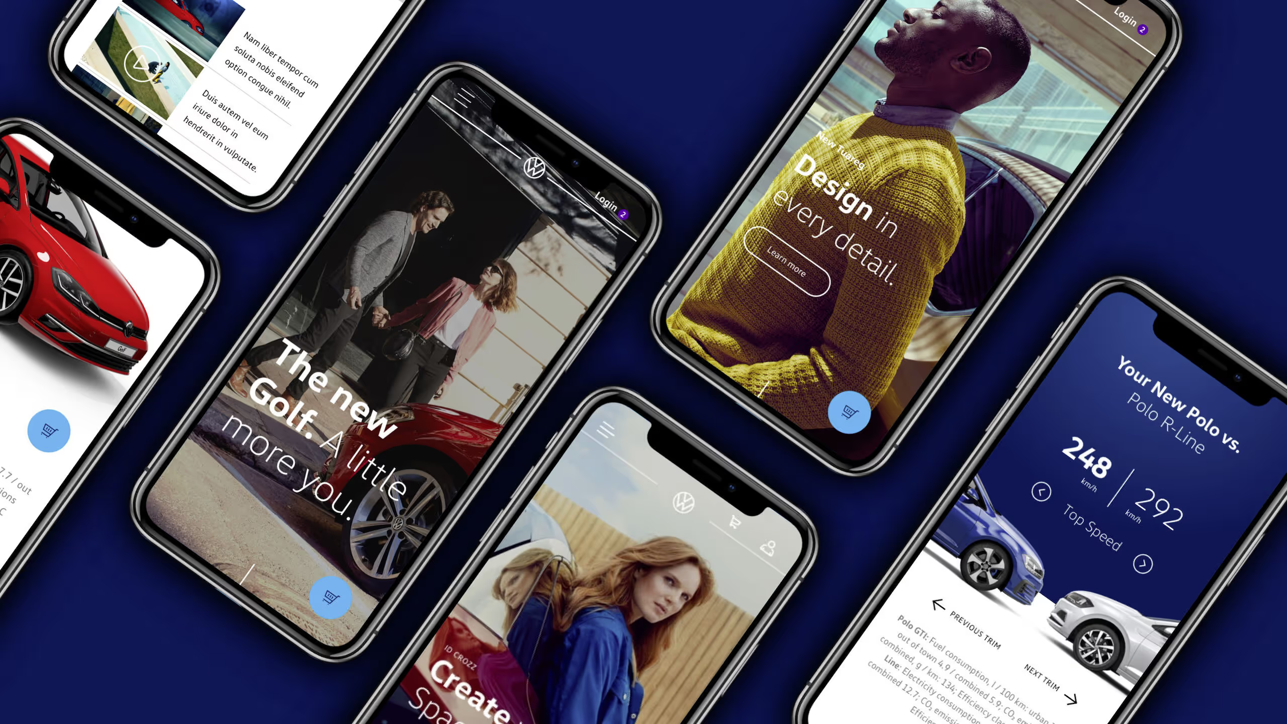
Around the styleguide grows a component-based structure: products scale without losing the brand. Mobile follows the same logic — extending the system instead of fragmenting it.
The Basic App Styleguide
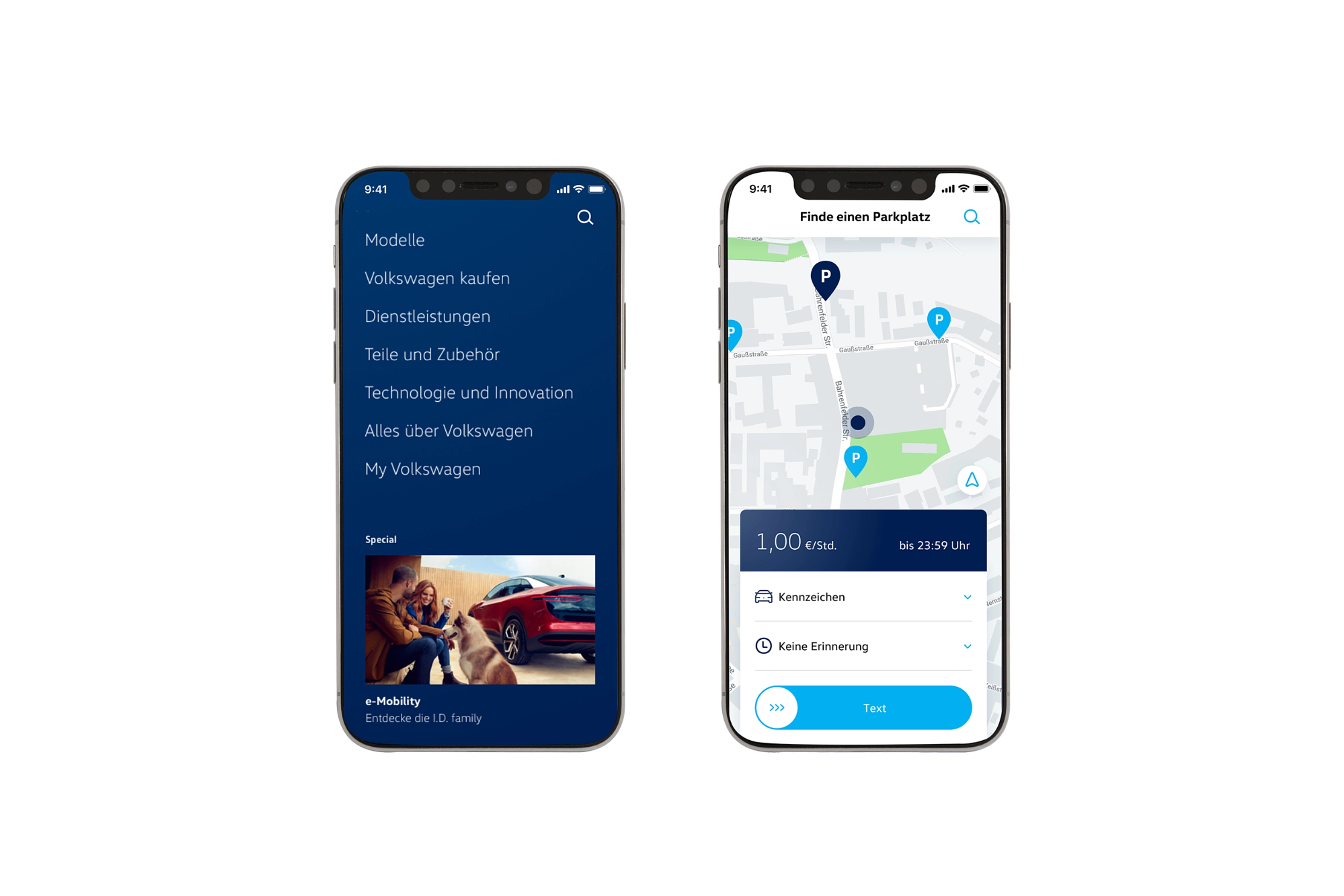
Apps follow their own rules. So the system gets a second building block: the Basic App Styleguide — also under my ownership. It enables teams to design and build applications that add to the holistic brand experience instead of standing next to it.
The context
One of the largest rebrandings in the world.
The New Brand Design premieres at the IAA in Frankfurt in September 2019 and rolls out globally: Europe first, then China, North and South America from 2020. The new logo is flat, reduced — and for the first time consistently designed digital first.
171
markets converted worldwide
154
countries
70,000
logos exchanged across dealers & service
9
months from idea to premiere
19 + 17
internal teams + agencies in the powerhouse
2019
premiere at the IAA, digital first
Sources: Volkswagen Newsroom · media.vw.com · Design Week
Imagery you can touch
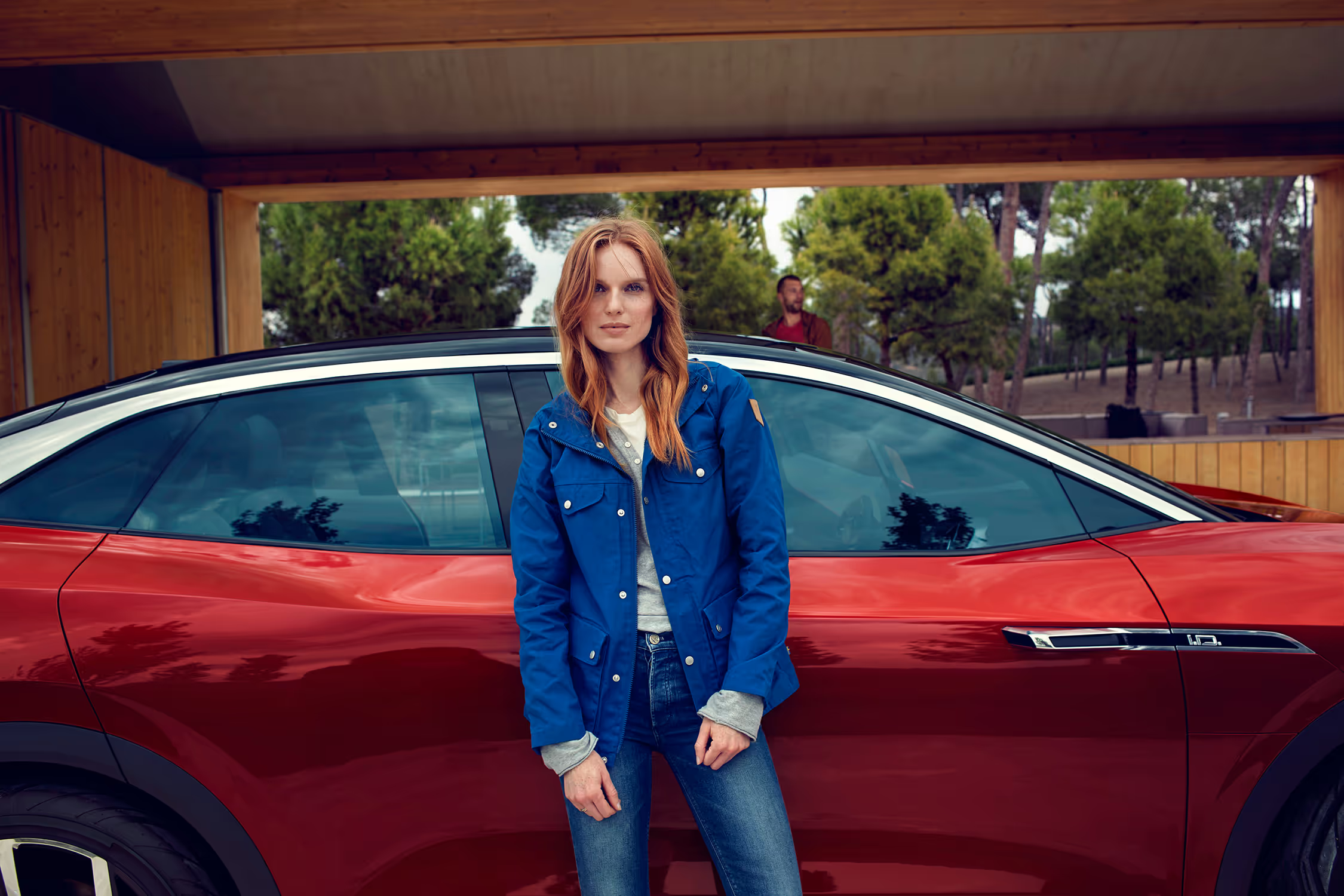
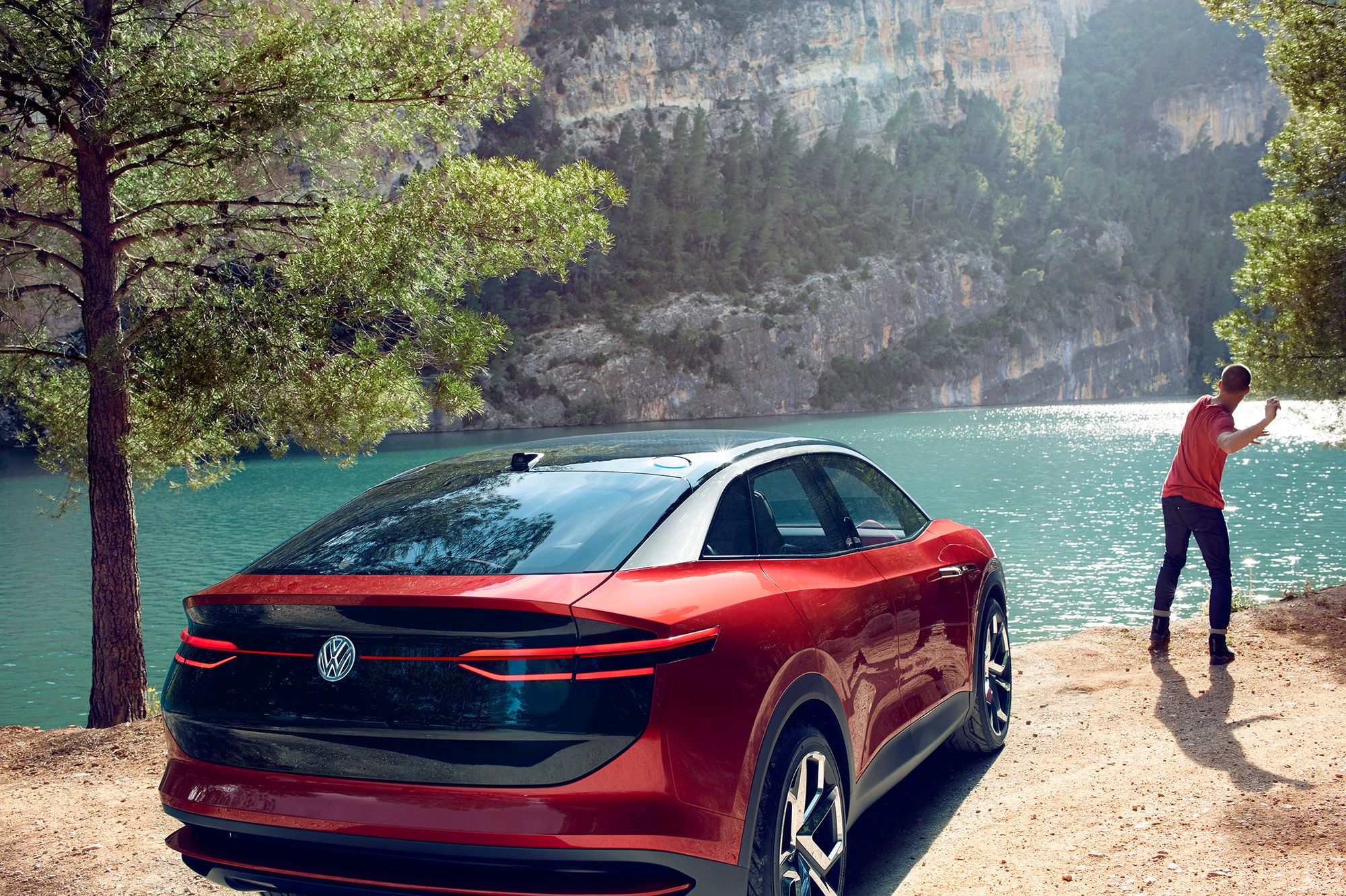
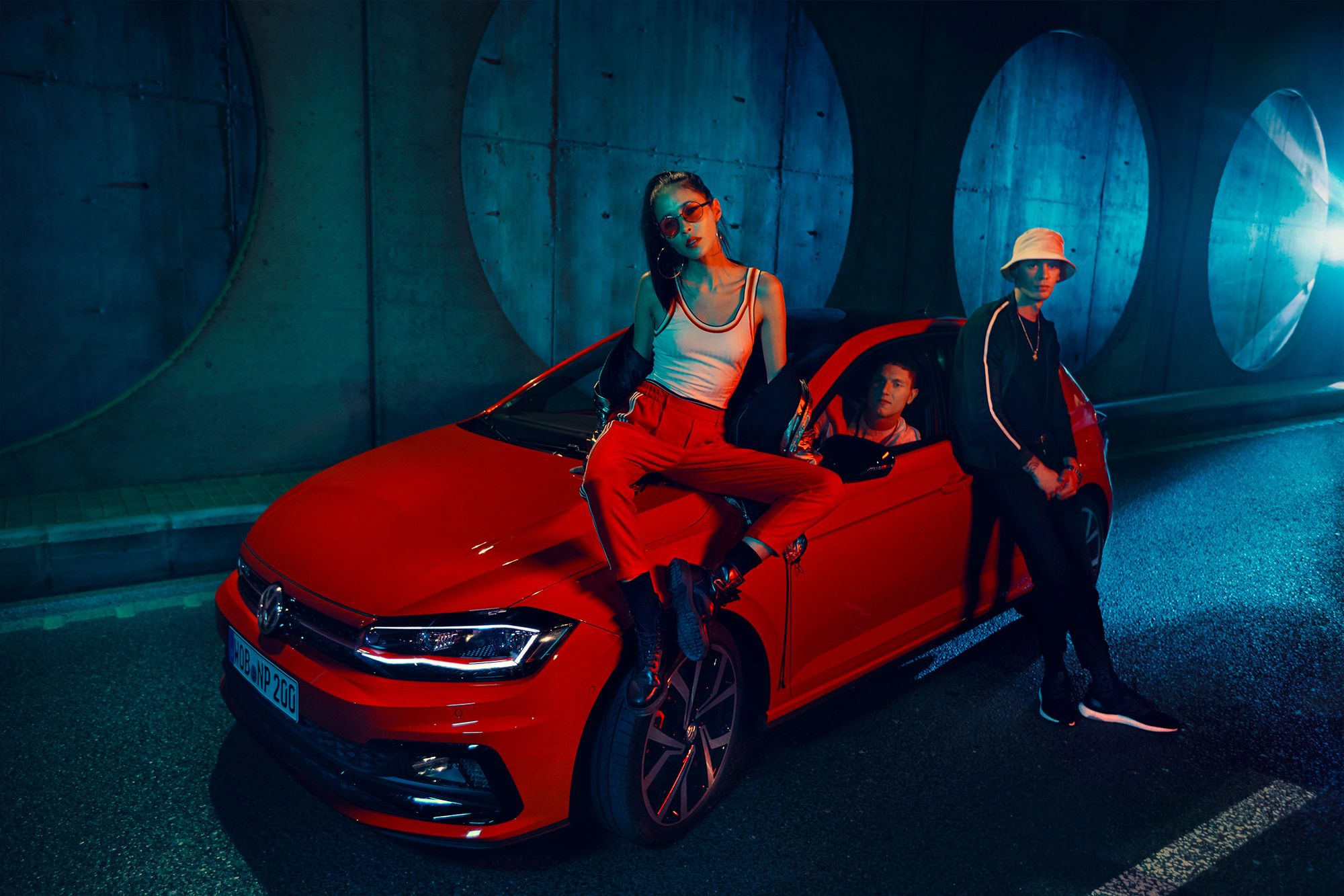
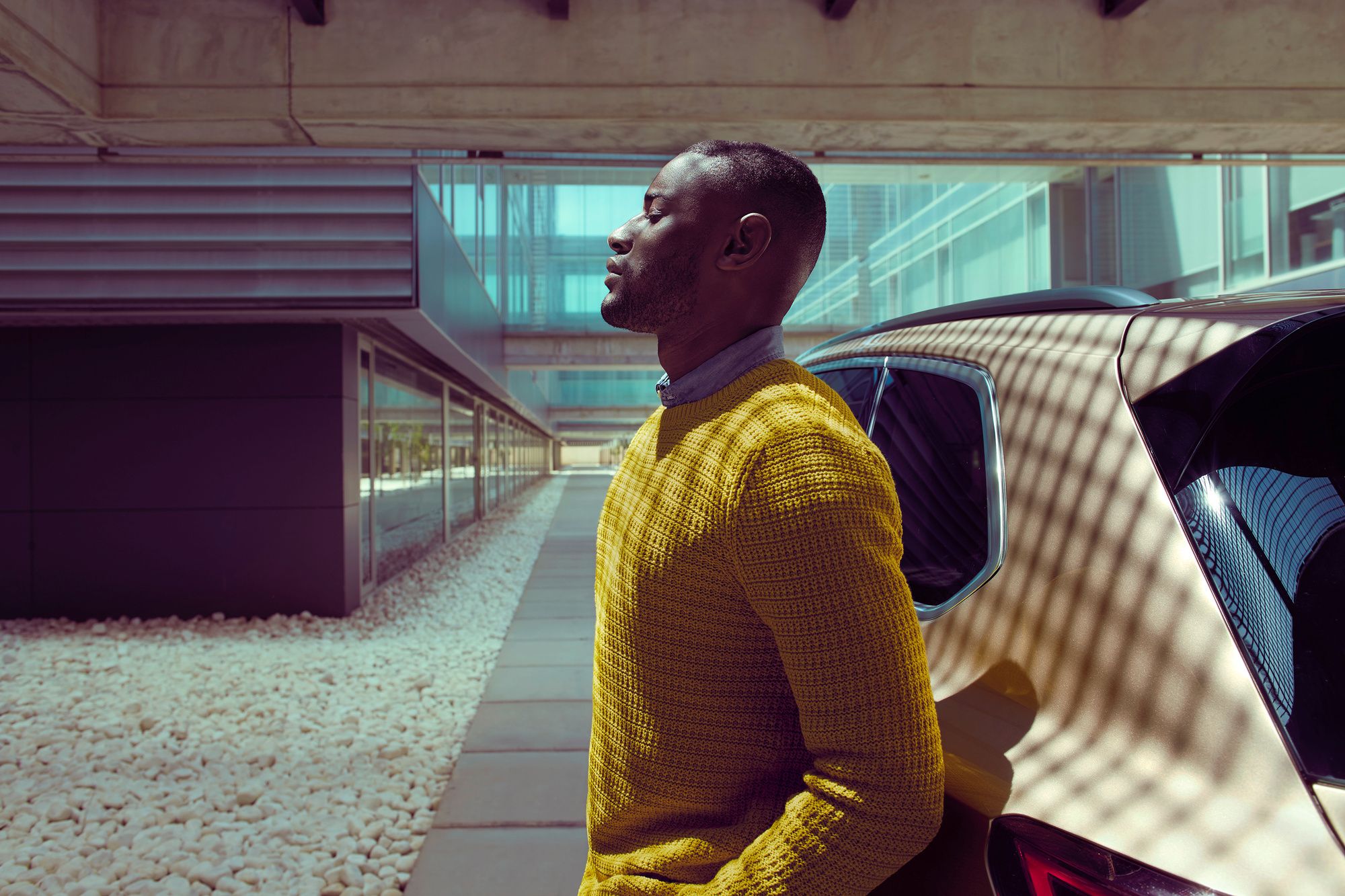
The visual language turns with it: closer, more human, less gloss. People take the center, the car becomes part of their lives — not the other way round.
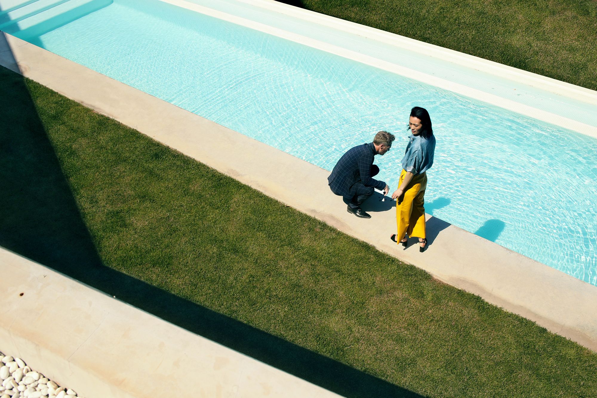
From the illustration styleguide
Not just defined — demonstrated
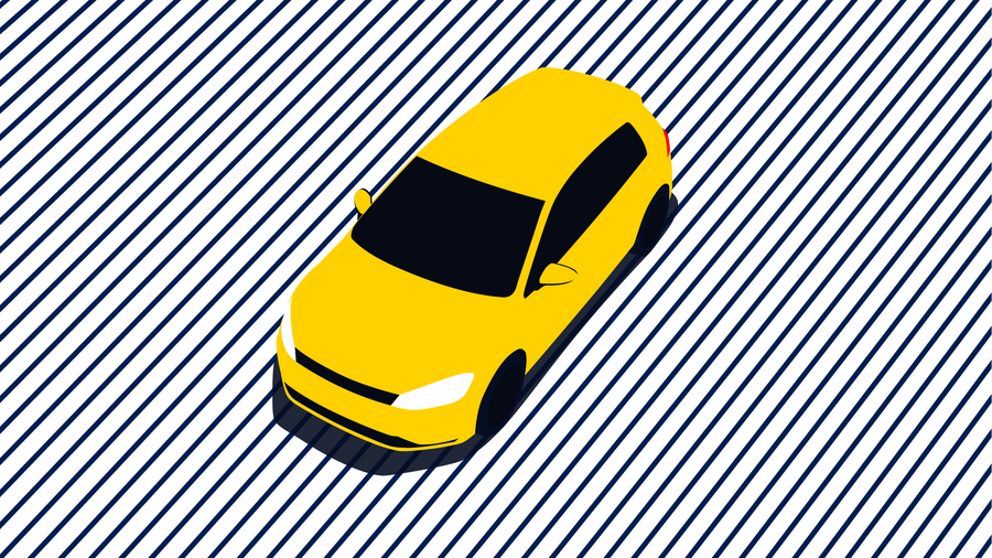
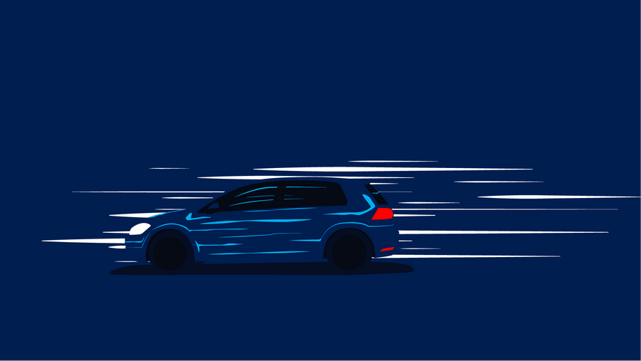
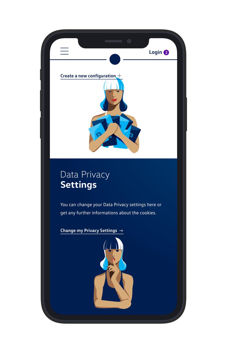
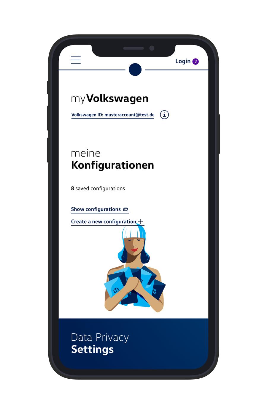
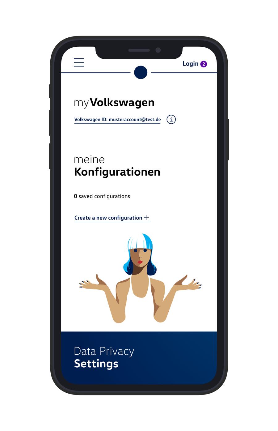
Every illustration here is mine — drawn to the specs I set for the styleguide myself. From the car to the character world, and from there into the myVolkswagen app.


Still running
The system is never finished — that is the point. It exists in use: across markets, teams and products. Maintained, adapted, stretched. After the rollout, that is exactly what I secure: quality, across every digital touchpoint.
That is the kind of responsibility I bring to every project: building systems bigger than me — that keep running without me.
Contact
I have
a brand
and I need
direction.