Case
Landvergnügen
An app for people who'd rather wake up on a farm than on a campsite. Rethought from the ground up.
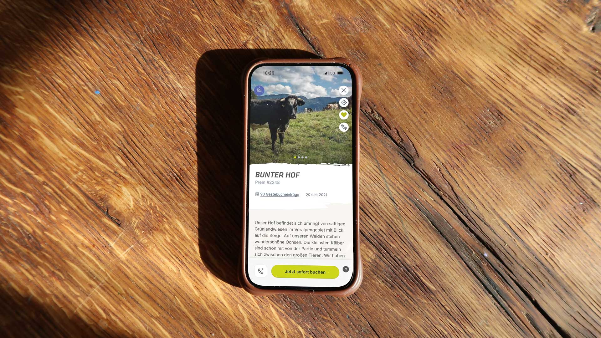
Landvergnügen takes campers to farms, wineries and alpine pastures. The product kept growing more popular, but at some point the app couldn't keep up. The paths were complicated, the structure too rigid, and a lot of it felt more like admin than holiday.
So instead of tinkering with the old app, we rebuilt it. My job was to turn requirements, user needs and technical possibilities into a clear product — and to hold the design direction from the first workshop to launch.
My responsibility
From “we need a new app” to “it's in the store”.
Product vision
It started with a rather big wish. Together we turned it into a plan: What stays? What's missing? What needs to get simpler? And what can go in good conscience?
Design leadership
I developed the design direction, brought decisions together and made sure product, brand and interface tell the same story. Not just in the presentation, but also when things got concrete and complicated.
UX and UI design
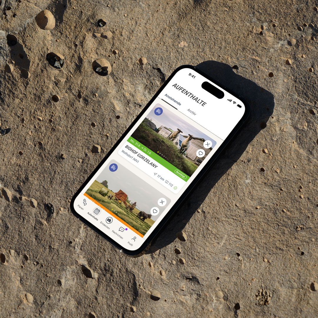

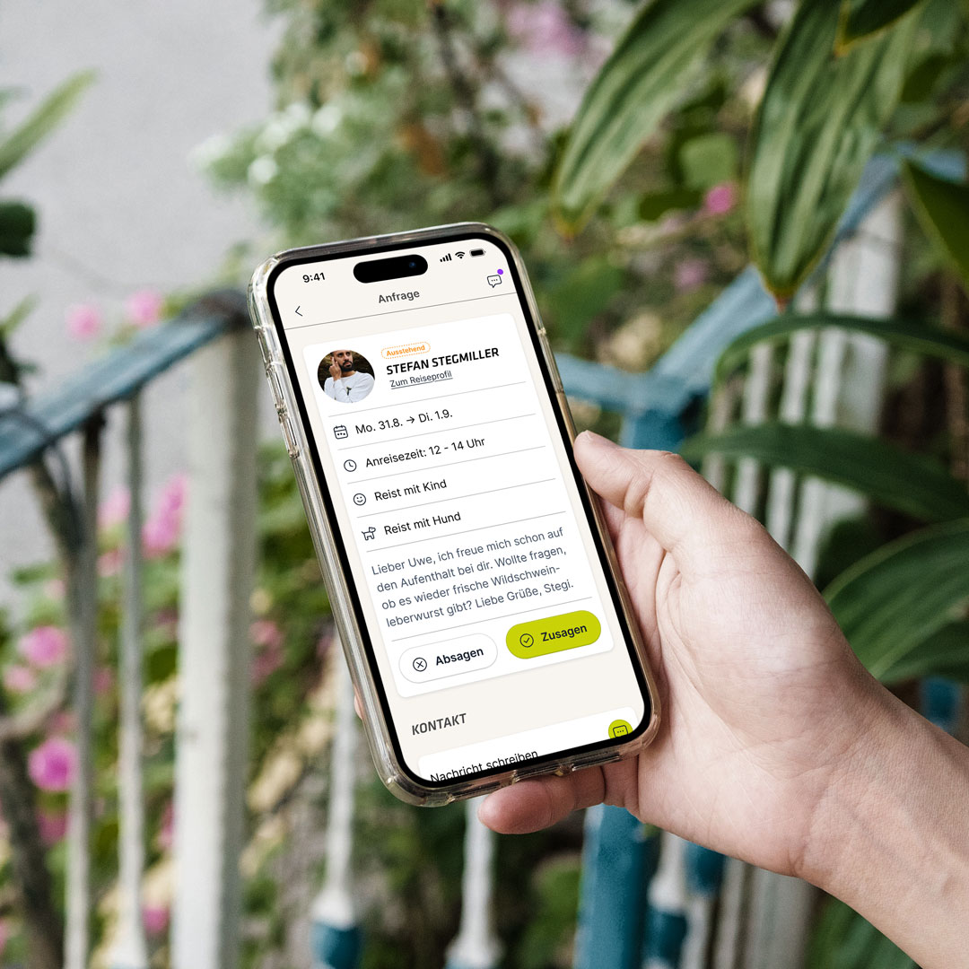
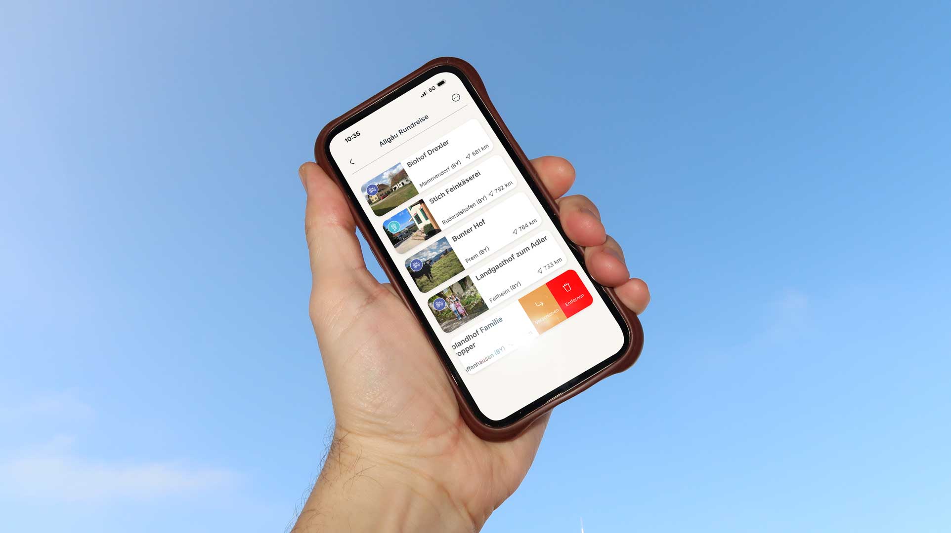
The app was rebuilt around five clear areas: Plan, Stays, Discover, Messages and Profile. I designed the user journeys, flows and interfaces. From the first browse to the booking to the route to the farm.
Design system
In parallel, a modular design system took shape, with reusable components and variants. It kept the app consistent across many features and let it grow cleanly alongside development.
How I worked
Closely with the Landvergnügen team and directly on the product. First we understood how people actually plan their stay. Then came structure and flows, then prototypes and finally the interface. Decisions were made on the smartphone wherever possible. That's where you find out fairly quickly whether something works or just looks good in a presentation.
What counts in the end
Landvergnügen got an app that fits the product again. Clear in structure, simple to use and open to whatever comes next. And I was reminded once again that a holiday is a lot easier to design than to book.
Contact
I have
a brand
and I need
direction.