05 Aug 2026
The prompts that built this site
This site was built in dialogue with AI. All of it. Ever since, the same question keeps coming: "Show me the prompts." Behind it sits the hope of a formula. A few magic words, combined correctly, and the machine builds you a portfolio.
Here are the prompts. And the drafts they cost. Fair warning: the magic words will disappoint you. And the story starts earlier than most people think.
Before the first pixel
The whole site came together in one week. Which makes what it didn't start with all the more important: pixels. It started with questions. Who comes to this site? Why? What is supposed to happen? The answers still live in the repo, as versioned markdown documents: one for the positioning, one for personas, user flows and sitemap. Every phase had a gate that unlocks the next, and the project document held the sentence that disciplined everything: code doesn't start before phase 4. Not earlier.
The most important insight from that time sounds banal and yet shaped every later decision: the traffic here is warm. Whoever arrives comes via referral or LinkedIn and already knows my name. The site doesn't have to explain anything — it has to confirm, within twenty seconds, that the impression holds. One single conversion path, no detours. When it later came to colors, heroes and animations, that was the yardstick everything was measured against.
No CMS, no site builder
The tech plan looked classic at first: Sanity as CMS, Mux for video streaming, Framer Motion for the animations. While building, all of it flew out, piece by piece. Not out of principle — out of experience: every moving part wants maintenance, and a portfolio is not a SaaS. The system question itself? Two messages:
Right, I think I'm happy with my design for now. Can you check what we need for this? Specifically Discord or Telegram. E-mail, journal. Vercel?
Telegram. Markdown is fine for now. Set up the repo, yes.
What remained is Next.js 15 with Tailwind v4, every page statically pre-rendered. The journal you're reading right now is a folder of markdown files in the repo. The videos live locally. The motion is hand-written scroll choreography per section. And the chat at the top of the homepage talks to my phone via the Telegram API. The real win: everything lives in one repository — content, design rules, code. Versioned, searchable, readable by humans and machines. There is no backend where anything can go stale.
"I think all three are terrible"
Real prompt, word for word. The AI had built three moodboards. Tidy. Diligent. Interchangeable. My answer: one sentence of rejection.
It worked. Better than any technical instruction before it. From then on the direction was clear: not that. The machine delivers endless variants. Which one feels like me, it cannot know. That is my job.
References instead of adjectives
After that: no more describing moods. Sending links instead. Always with one sentence about what interests me. How one site tells its story. The warmth and personal voice of another. A hero that slides a real photo and an AI image into each other.
That was the turning point. A reference plus one sentence about why it matters beats any list of adjectives. "Warm but professional" can mean anything. "Look how this site talks to you" means exactly one thing.
The first draft
Out of that came version one. Black and white, hard type, my face behind three words.
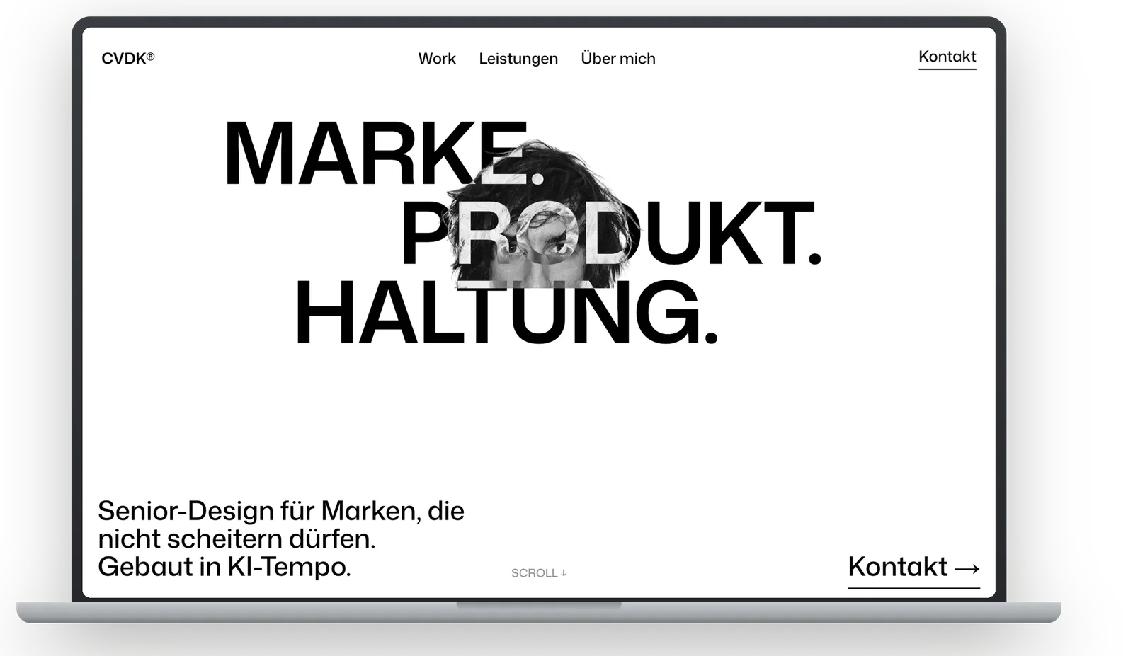
My review notes from that phase, straight from the log — translated, spelling repaired, tone untouched:
None of this looks that good.
Dreadful AI standard. Content-wise it sounds like I'm an old man who used to do great things. It looks like a free WordPress template. Junk.
I never liked it. Too cold. Too much pose. Too little me. Still the most important draft of the project: finally something concrete on the table. Something to push against. "Stop. This is going nowhere" only works once there is something to stop.
A conversation instead of a hero
At some point it was clear what bothers me about portfolio homepages: they deliver monologues. So, the other way round. The site doesn't talk about me. It starts a conversation. A chat as the hero, as low-threshold as possible. The first message really reaches me.
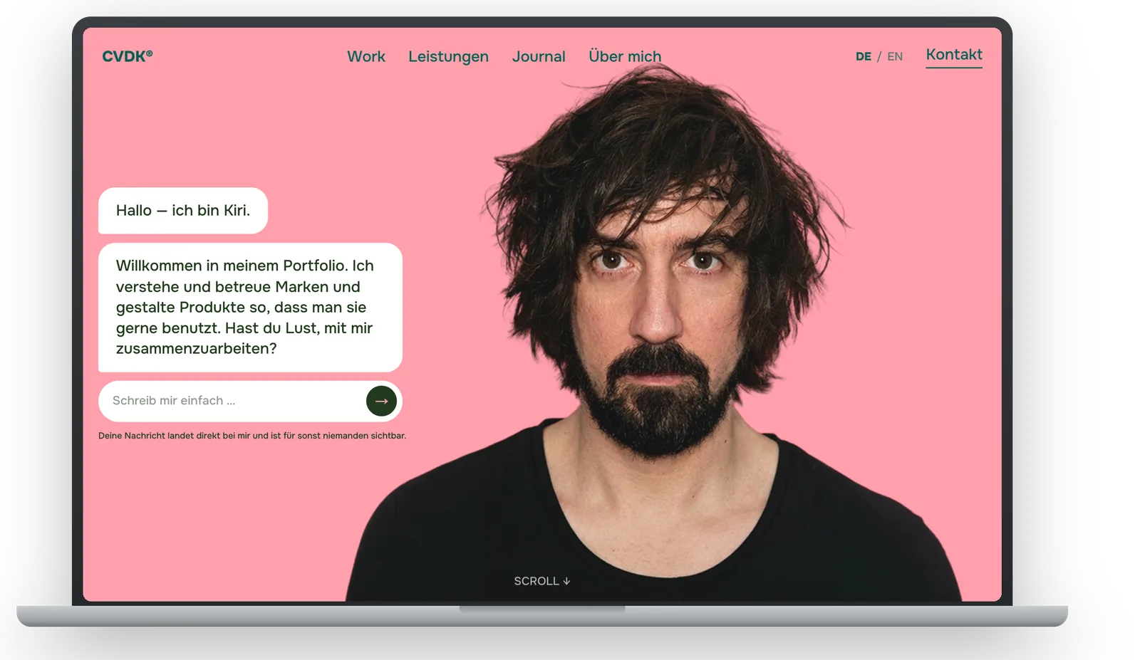
Still my favourite idea. Didn't come from the machine. Came from asking what the site is for: getting us talking. I wrote the greeting myself. The AI built, translated, refined. That way around, it becomes a tool.
One vita, four attempts
No element ate more iterations. Attempt one, my idea, my prompt: "a kind of staircase with rounded corners that scrolls horizontally and builds up."
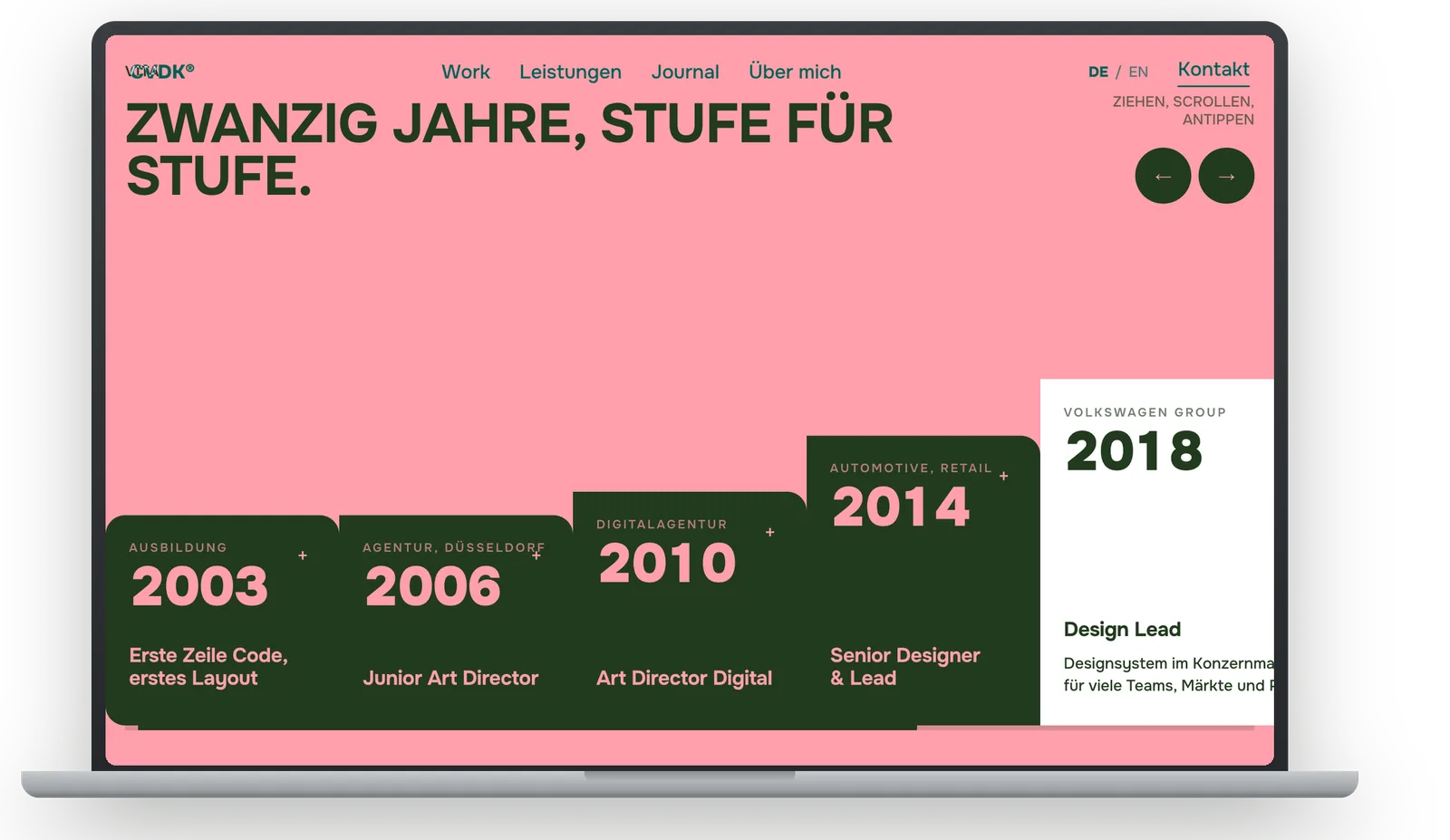
Too tame. So I pushed, also verbatim: "Act as an outstanding graphic designer and deliver a fused, bold, decisive, iconic design. Everything has to look like it was made by a designer, not a developer." Then: a monolithic staircase. An accordion. A carousel. One "blow me away with great graphic design". None of it survived.
The jukebox turned out so horrible that I threw it out. I wrote the vita text myself.
In the end: years cut, text written myself. Two columns, a photo from 2003 next to it. Done.
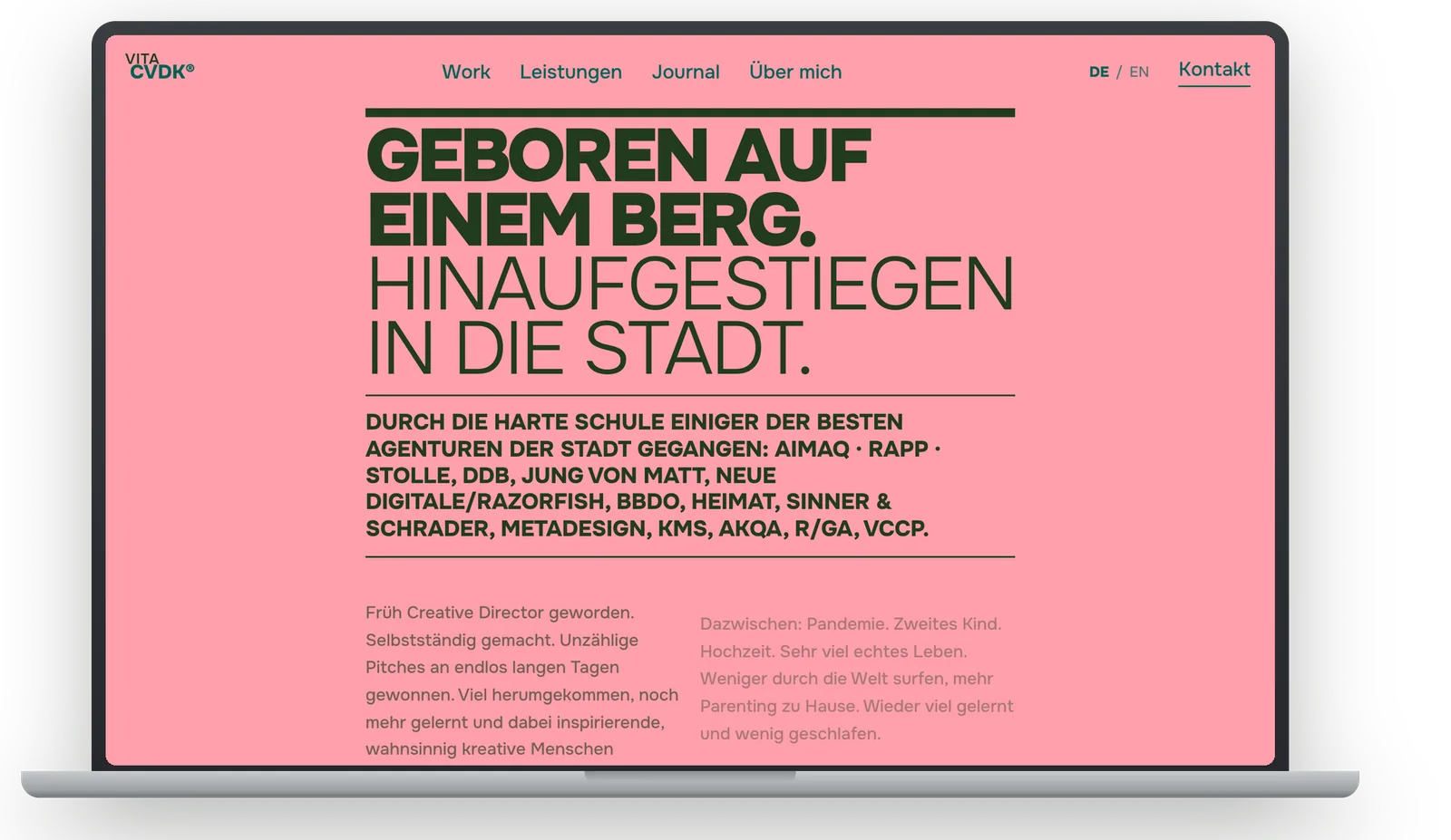
Four attempts. Four working features. Three deleted. Sounds like waste, is the opposite: every attempt sharpened what the vita should not be. And because the machine delivers in minutes, I can afford four attempts in the first place.
The smallest prompts
Final phase. My most frequent prompts: one word. "Gone." "Cut that." "Bit bigger." Curating instead of dictating.
And when a prompt did get longer, it was an image: "On hover, a wave runs through the letters from left to right. Each letter briefly scales up and springs back — like a piano key being pressed."
"Make it more modern" is not a prompt. It's a sigh. A piano key that springs back can be built.
Three sessions at once
Even now, this site isn't being built in one chat. The design was iterated in Claude Design and frozen into the repo as a reference; the building happens in Claude Code. And since the foundation stands, several sessions run in parallel: one extends the Audi case, one writes for the journal, one polishes logo and homepage. To keep it from drifting apart, they all read the same state on startup — the roadmap in the repo literally begins with: "New session? Read this first." Every step gets its own commit. The git history is the project's memory.
That sounds like overkill for a portfolio, and that is exactly the point: it's a trial run. This is how a product team of AI sessions orchestrates itself — shared memory, clear responsibilities, one human setting the pace. And yes, sometimes two sessions get in each other's way. A rebase at the wrong moment, a brief scare in the log. That's part of the truth too. Just like the everyday business between the big decisions:
Can't see anything.
localhost:3000 isn't running.
Can't reach the site. Link please.
What makes the difference
Not the individual prompts. Everything around them. A frozen design document that every change has to answer to. A verification ritual: after every change the AI takes screenshots and checks its own work. Desktop, mobile, reduced motion. And the willingness to disagree with the machine. Again and again. Friendly and firm.
Prompts are not magic words. They are art direction in written form. If you have spent years learning to tell a team precisely what is good, what is missing and what has to go, you talk to AI like the best junior of all time: insanely fast, insanely well-read, and entirely dependent on you for taste.
By the way: this article started the same way.
Can you write me a sample article for the journal? About the prompts that built this site.
The honest answer to "show me the prompts": you are looking at them. This site is the transcript.